Aceites La Muralla cans: history, design and format.
We take a journey through the history of our most historic formats and cans, which will serve as inspiration for the restyling of the Cortijo La Muralla brand. Which one do you choose? We read you on our Instagram or Linkedin.
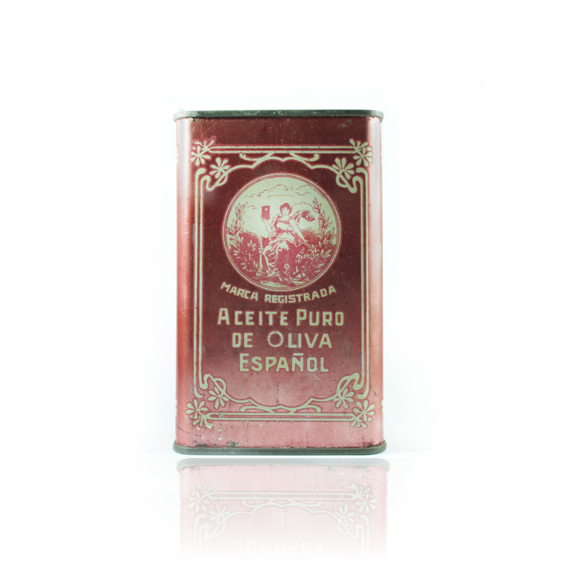
Red and modernist style, the main protagonists of the first format.
We begin by analyzing one of our oldest cans, which dates from the late nineteenth century and has a clear French modernist inspiration, very much in the Tolouse-Lautrec style.
This style is characterized by the two-dimensional use of organic elements such as tree branches and flowers, highlighting Renaissance elements such as the Greco-Latin muses. It was a style applied to posters, illustrations and graphic arts in general.
In the center of the can we see a muse, as we have mentioned, which reminds us of Delacroix's "Liberty Leading the People". In this case, this woman is carrying Manuel Villén Priego's own can of extra virgin olive oil.
This 2-liter format was distributed under the brand name "Pure Spanish Olive Oil", an unthinkable denomination to register today, as it is a very generic category. Manuel Villén Priego was a pioneer in the export of EVOO and therefore found no impediments to registering such a simple and descriptive concept.
According to Manuel Villén Otero, current general manager of Aceites La Muralla and the great-grandson of Manuel Villén Priego, "this format was the most demanded for gifts outside our borders. It would be the premium gift equivalent of ouriOliva case . Glass was not used for export because the logistics systems were not as secure as they are today. In the end, stacking cans in large containers was a convenient way of both transportation (mainly by sea) and consumption. Design was already very important at the time, so the entire can was printed. No nutritional information was included because sanitary protocols were practically non-existent, let alone agreed upon between countries. Just to see that it was Spanish oil was a sign of guarantee".
From that time on, the color red marked the essence of Aceites La Muralla and its first designs, since Cortijo La Muralla had this color, inspired by the shades of brick and ceramics so characteristic of Andalusian architecture (Mosque of Cordoba, Plaza de España in Seville, etc.). Red has been maintained over the years both in Aceites La Muralla (the group's brand) and in the product brand Cortijo La Muralla.
The latter is in the process of restyling, and will be inspired by the elements that make up the historical cans for its new design.
The first "five liters" of Oils La Muralla
In this can, it was decided to replace "the EVOO muse" in the central drawing with a firm and robust seal with the surname Villén, a very well known at the time and a sign of guarantee.
"Trademark" is kept under the image, implying that "Villén" is the brand to which it refers. But no. "Aceite Puro de Oliva Español" is the registered trademark, as we indicated in the previous format.
In this period, "the family" from which the oil comes from has more value than the brand itself, that is why both the full name or the patron's surname are mentioned.
In terms of design, the previously more modernist and fluid frame becomes more geometric, a clear allusion to Andalusian mosaics and tiles. A very subtle green color is introduced that could represent the olives framing the can.

El dorado, como representación del "oro líquido".
Beginning of the 20th century.
When "extra virgin olive oil" as a concept had not yet been developed, the terms "pure" and "extrafine" were used to refer to that type of oil produced only by mechanical processes and with an optimal extraction that maintained all its properties and flavor. In other words, the greatest treasure of our land.
This can was in force in two versions: Spanish and English. In all the cans "Rute, Cordoba, Spain" is mentioned as the place of origin. This is due, in the words of Manuel Villén Otero, to "the recognition that has always had the south of Córdoba, in particular, the Subbética Cordobesa, as a gold mine of extra virgin olive oil. We have always wanted to highlight the origin of this oil and not generalize to 'Andalusian oil' or 'oil from Cordoba' so that the customer has a direct association of our product with the natural enclave to which it belongs".
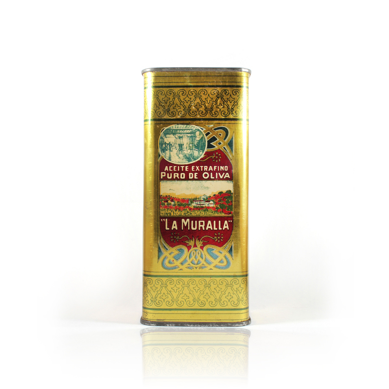
The yellow, combined with blue details and rounded shapes, symbolized the sun and the sky that frame our olive trees. As we can see, red is not lost. The Cortijo "La Muralla", home of the Villén family, is mentioned for the first time. "La Muralla" is registered as a trademark and distributed in the United States by Corn-Davis & Co (New York).
The central illustrations vary according to the can. In the example on the left we see the Cortijo in the center and then a mixture of olive grove, wheat field and poppy field (matching the red). In other versions, only olive trees and cypresses are shown, a more realistic image of the real Cortijo La Muralla.
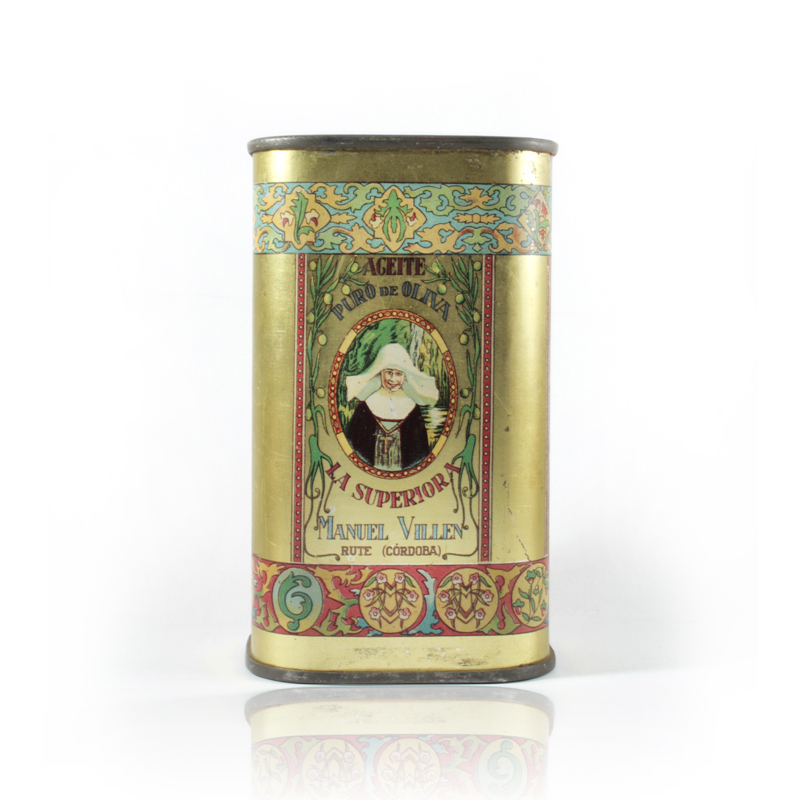
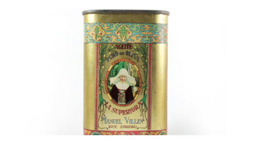
Marca "La Superiora" : el inicio de los AOVE premium.
"This pure olive oil is elaborated with the most perfected procedures, with olives carefully chosen from my region, considered as producers of the best oils in the world. It is recommended to people with exquisite taste and fine palate".
This is the text that appears on the side of the "La Superiora" can, under the signature of Manuel Villén Priego, although it is believed that it was his sons who bottled and distributed this oil. Undoubtedly, a text where marketing and personal branding are very present.
The design becomes more complete, organic and baroque and now it is the olive branches and olives that frame the scene. In the center, the Superior. We do not know the history of this lady and therefore we cannot know if she is a real person, an inhabitant of Zambra or Rute, whose portrait was used to illustrate this mark. Manuel Villén tells us that "his grandfather mentioned that the brand 'La Superiora' was used to make a connection between the 'superior' quality of the oil and the highest position in the abbey: the Mother Superior or Abbess. These cans had a smaller format because they contained the best extra virgin olive oil obtained from Manuel Villén's farms. It had to be distinguished from 'La Muralla' in some way, which was the main brand, the best known and most consumed." As we mentioned before, these cans already have a strong marketing presence and the association of ideas is fundamental to the connotation of the brand.
Manuel Villén no longer appears on the can as "Harvester and exporter", but as "Manufacturer and exporter", giving the oil production a more industrial and less harvester character. Indirectly, it is intended to convey a greater productive capacity by using these terms.
It is undoubtedly the most festive can in our catalog of historical cans, as it mixes the traditional red, blue and gold background mentioned above, but now also has a strong green color, to emphasize the raw material from which the oil comes from.
How has the brand, design and formats changed? Well, more or less like this:
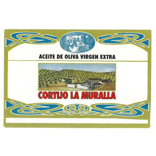
We have had the current label for more than 20 years. In the last five years we have been very focused on the development of our premium brand iOliva and we are very satisfied with the result. We believe that we are right at the moment to focus on our most recognized and popular product brand, Cortijo La Muralla, the one that has been adding loyal and passionate customers for our EVOO for more than a century.
We have very clear some essential elements in the next brand restyling and other new ones that are still being forged. We believe it is time to give Cortijo La Muralla a twist towards the avant-garde, always inspired by the classic and distinctive elements of our history.
